Customizing UI / Theming
It is possible to customize styles for login screens to match your branding. This can be achieved by simple colors and logo override of the default them, or by full CSS replacement.
If you are looking to do a full custom theme, we recommend using Keycloakify to build it. This allows you to use React components to build your theme and provides backwards compatibility.
Phase Two are sponsors of Keycloakify as we are deeply convinced by this project's value.
Simple
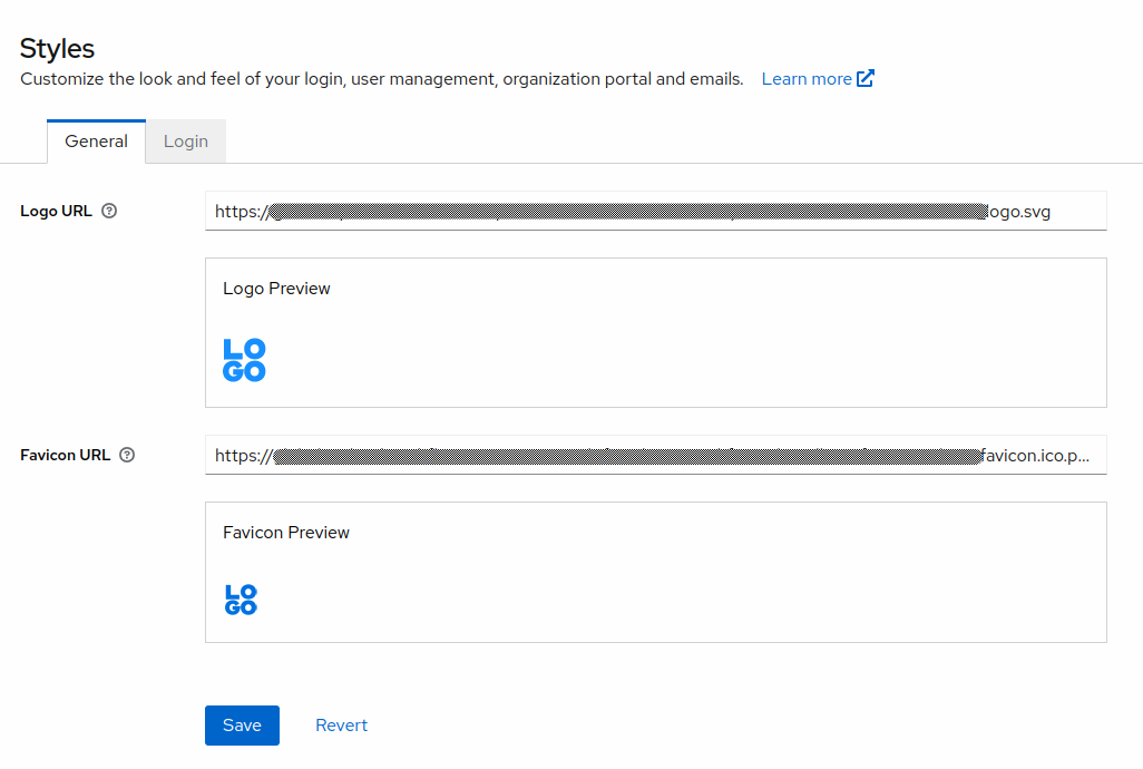
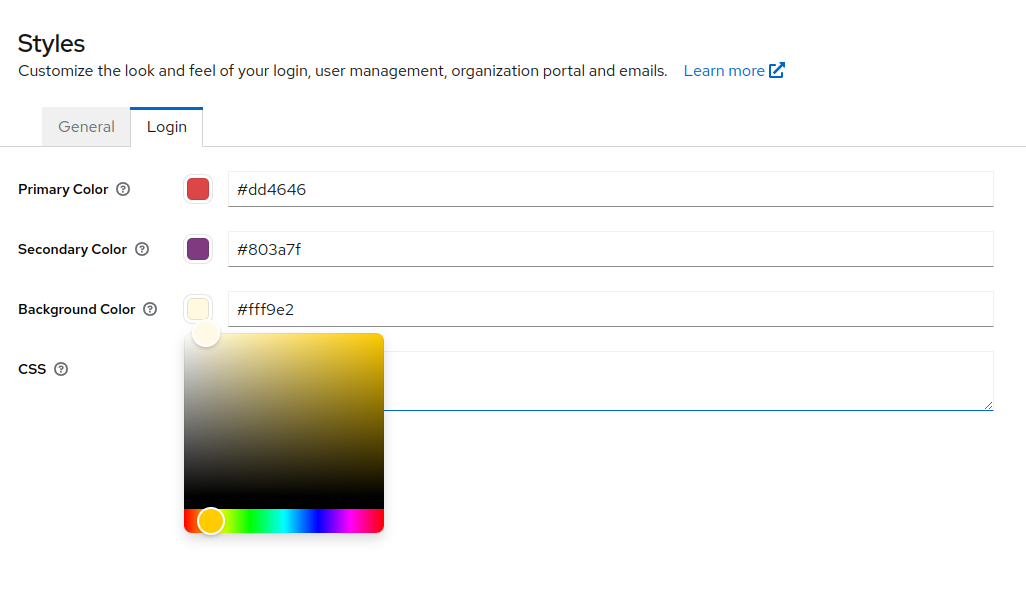
The simple override of colors and logo can be access in the admin UI in the Styles section. The available override values are
- General tab
- Logo: URL of your logo image. This will be constrained to 150x150. You should use an SVG or PNG with alpha channel to make sure this renders properly on your background color and in the Admin Portal, if you are using it.
- Favicon: URL of your favicon.
- App Icon Url: Url of the App Icon used within the Admin Portal
- Login tab
- Background color: Hex color for background.
- Primary color: Hex color for primary.
- Secondary color: Hex color for secondary.
Full CSS
Full CSS can be added on the same page in the Admin UI. This stylesheet will be loaded last. Note that the use of a full CSS file will override the values from above. For more information on the styles used in the login pages, see Patternfly v5, and the Keycloak base and keycloak themes.
Phase Two has assembled a few custom themes that can also be used. View them in our Keycloak Themes Repository.
If you need a lightweight customization to the variables that Phase Two exposes but want to use custom CSS, try this
/* This will override built-in PatternFly Color Scheme */
:root {
  /* Primary Colors */
  --pf-v5-global--primary-color--100: #5b9fdd;
  --pf-v5-global--active-color--100: #5b9fdd;
  --pf-v5-global--primary-color--dark-100: #5b9fdd;
  /* Primary Link Colors */
  --pf-v5-global--link--Color: #5b9fdd;
  --pf-v5-global--link--Color--dark: #5b9fdd;

  /* Primary Colors - 20% darker */
  --pf-v5-global--primary-color--200: ##1570c2;
  /* Link Hover Colors */
  --pf-v5-global--link--Color--hover: ##1570c2;
  --pf-v5-global--link--Color--dark--hover: ##1570c2;

  /* Secondary Colors */
  --pf-v5-global--secondary-color--100: #edf5fb;
}

/* Adjust the colors for links specifically */
a {
  color: var(--pf-v5-global--link--Color);
}
.login-pf a:hover {
  color: var(--pf-v5-global--link--Color--hover);
}

/* Adjust outline or focus colors for inputs */
input[type="text"]:focus,
input[type="text"]:focus-within,
input[type="text"]:focus-visible,
input[type="password"]:focus,
input[type="password"]:focus-within,
input[type="password"]:focus-visible {
  outline: var(--pf-v5-global--active-color--100) auto 1px;
}
Manually by Realm attributes
The above methods for updating the style store the values as Realm attributes. If you prefer to programmatically set these, use the following Realm attribute keys:
Login
_providerConfig.assets.login.css_providerConfig.assets.login.primaryColor_providerConfig.assets.login.secondaryColor_providerConfig.assets.login.backgroundColor
General
_providerConfig.assets.logo.url_providerConfig.assets.favicon.url_providerConfig.assets.appicon.url
Admin Portal
Full customization details can be viewed in the Phase Two Admin Portal Repo
_providerConfig.assets.portal.primary100_providerConfig.assets.portal.primary200_providerConfig.assets.portal.primary400_providerConfig.assets.portal.primary500_providerConfig.assets.portal.primary600_providerConfig.assets.portal.primary700_providerConfig.assets.portal.primary900_providerConfig.assets.portal.secondary800_providerConfig.assets.portal.secondary900_providerConfig.assets.portal.css
Custom Themes
If you decide to use a custom theme, you must contact Phase Two support to have it added to your Realm. It is only available to subscribes of dedicated clusters.
Coming soon will be the ability to upload custom themes via the Phase Two dashboard.
Keycloakify
Keycloakify offers two methods for building custom themes:
- CSS Customization: Basic, but ok for simple changes. Learn more in the Keycloakify documentation.
- Custom (React/Angular) Components: Full customization using React or Angular components, allowing for a more robust and custom theme. If you have a theme library or set of components, you would take this route. Learn more in the Keycloakify documentation.
Ultimately what you choose depends on your needs. We have found that CSS customization of Patternfly is very difficult to get right and cover all cases. In many situations, the built in Patternfly components leave much to be desired from a UX perspective. Our friends at Keycloakify are working on a solution to this, but until that's ready we've started out providing a Shadcn starter component theme which can be used.
Shadcn is a component library that provides a set of varied and robust components that can be used to build a custom theme. It leverages Tailwind CSS for styling and Radix UI for components. The starter only handles a couple of pages, but gives a template to start from. Feel free to use it and PR additions to the templates, we would love to see them!